Chapter 6 Faceting Figures
“But let the mind beware, that though the flesh be bugged, the circumstances of existence are pretty glorious.”
— Kurt Vonnegut, Player Piano
“You miss 100% of the shots you don’t take.”
— Wayne Gretzky
So far we have only looked at single panel figures. But as you may have guessed by now, ggplot2 is capable of creating any sort of data visualisation that a human mind could conceive. This may seem like a grandiose assertion, but we’ll see if we can’t convince you of it by the end of this course. For now however, let’s just take our understanding of the usability of ggplot2 two steps further by first learning how to facet a single figure, and then stitch different types of figures together into a grid. In order to aid us in this process we will make use of an additional package, ggpubr. The purpose of this package is to provide a bevy of additional tools that researchers commonly make use of in order to produce publication quality figures. Note that library(ggpubr) will not work on your computer if you have not yet installed the package.
# Load libraries
library(tidyverse)
library(ggpubr)
6.1 Faceting one figure
Faceting a single figure is built into ggplot2 from the ground up and will work with virtually anything that could be passed to the aes() function. Here we see how to create an individual facet for each Diet within the ChickWeight dataset.
# Load data
ChickWeight <- datasets::ChickWeight

# Create faceted figure
ggplot(data = ChickWeight, aes(x = Time, y = weight, colour = Diet)) +
  geom_point() +
  geom_smooth(method = "lm") + # Note the `+` sign here
  facet_wrap(~Diet, ncol = 2) + # This is the line that creates the facets
  labs(x = "Days", y = "Mass (g)")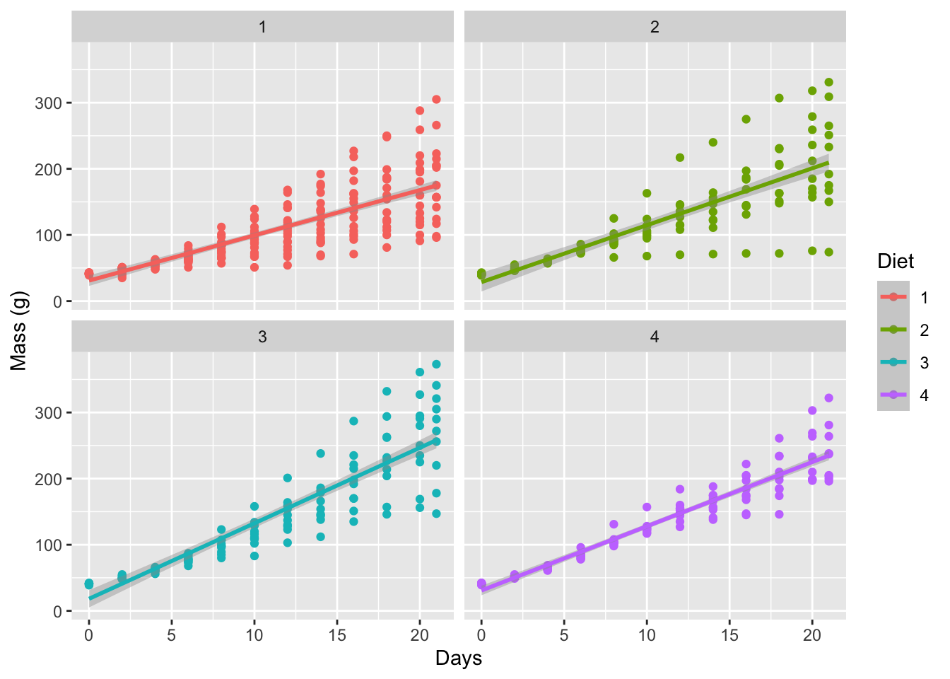
Figure 6.1: Simple faceted figure showing a linear model applied to each diet.
6.2 New figure types
Before we can create a gridded figure of several smaller figures, we need to learn how to create a few new types of figures first. The code for these different types is shown below. Some of the figure types we will learn how to use now do not work well with the full ChickWeight dataset. Rather we will want only the weights from the final day of collection. To filter only these data we will need to use a bit of the ‘tidy’ code we saw on Day 1.
ChickLast <- ChickWeight %>%
  filter(Time == 21)
6.2.1 Line graph
line_1 <- ggplot(data = ChickWeight, aes(x = Time, y = weight, colour = Diet)) +
  geom_point() +
  geom_line(aes(group = Chick)) +
  labs(x = "Days", y = "Mass (g)")
line_1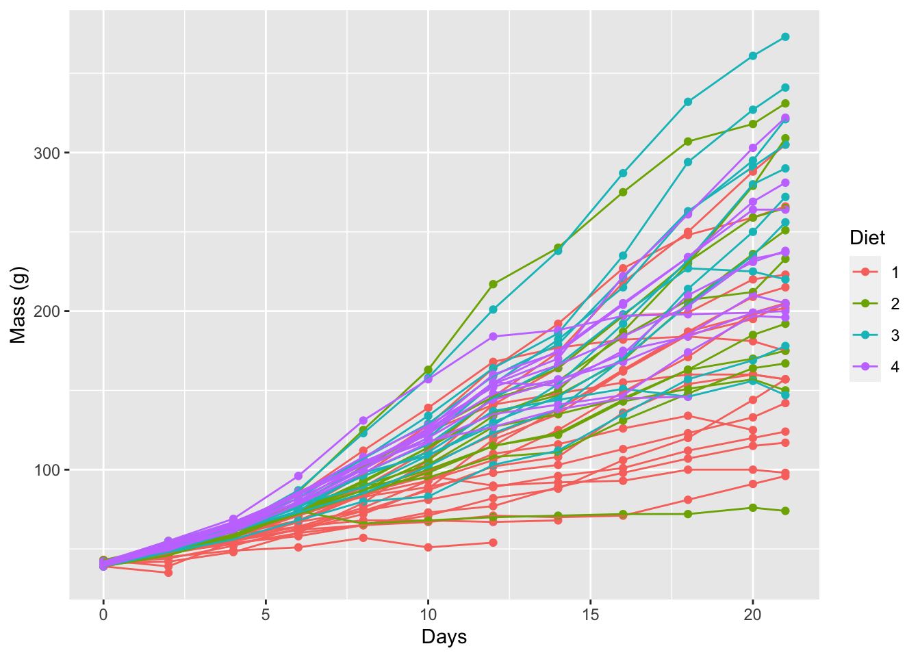
Figure 6.2: Line graph for the progression of chicken weights (g) over time (days) based on four different diets.
6.2.2 Linear model
lm_1 <- ggplot(data = ChickWeight, aes(x = Time, y = weight, colour = Diet)) +
  geom_point() +
  geom_smooth(method = "gam") +
  labs(x = "Days", y = "Mass (g)")
lm_1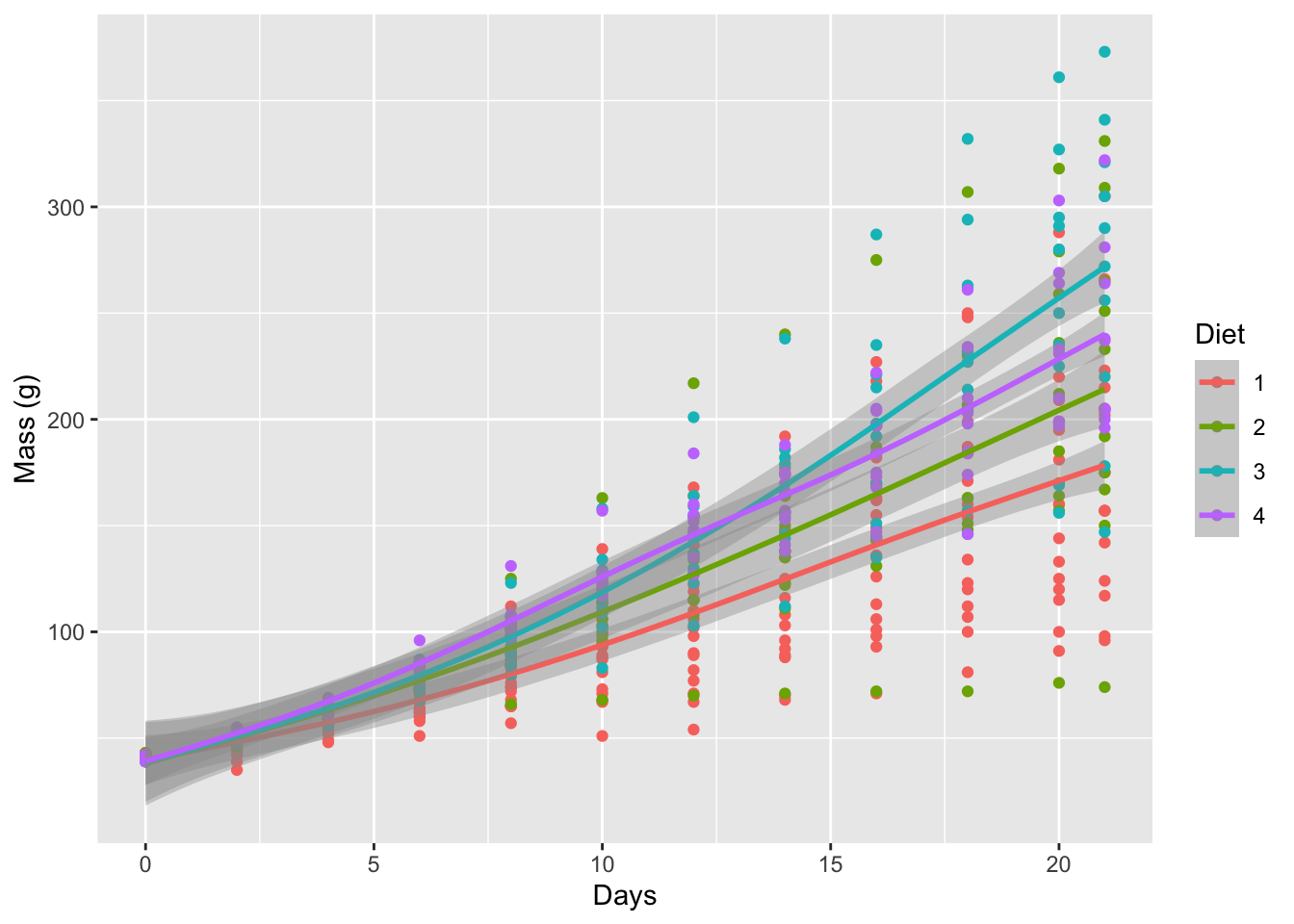
Figure 6.3: Linear models for the progression of chicken weights (g) over time (days) based on four different diets.
6.2.3 Histogram
# Note that we are using 'ChickLast', not 'ChickWeight'
histogram_1 <- ggplot(data = ChickLast, aes(x = weight)) +
  geom_histogram(aes(fill = Diet), position = "dodge", binwidth = 100) +
  labs(x = "Final Mass (g)", y = "Count")
histogram_1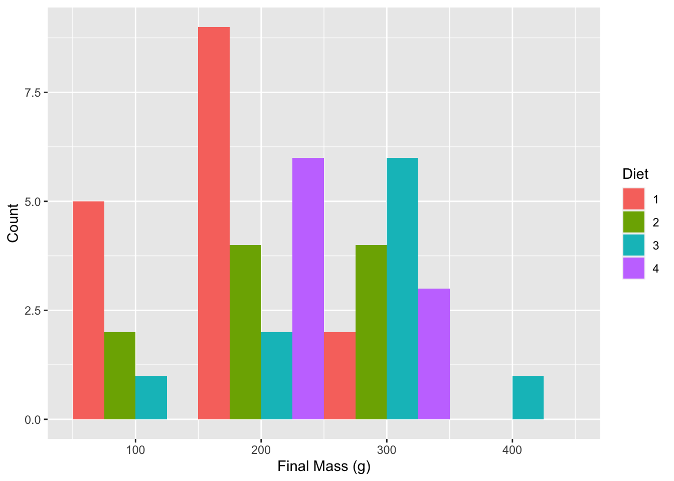
Figure 6.4: Histogram showing final chicken weights (g) by diet.
6.2.4 Boxplot
# Note that we are using 'ChickLast', not 'ChickWeight'
box_1 <- ggplot(data = ChickLast, aes(x = Diet, y = weight)) +
  geom_boxplot(aes(fill = Diet)) +
  labs(x = "Diet", y = "Final Mass (g)")
box_1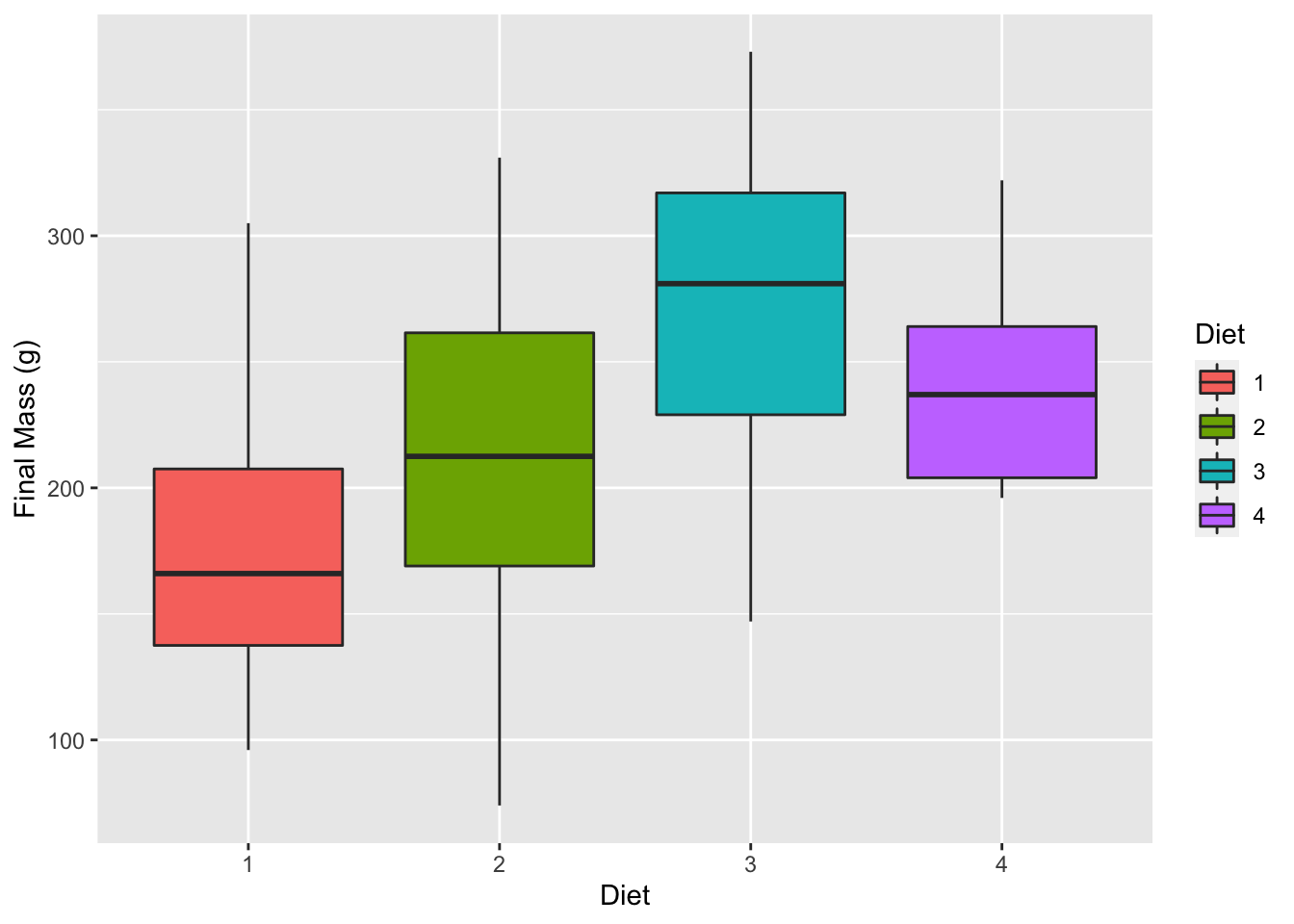
Figure 6.5: Violin plot showing the distribution of final chicken weights (g) by diet.
6.3 Gridding figures
With these four different figures created we may now look at how to combine them. By visualising the data in different ways they are able to tell us different parts of the same story. What do we see from the figures below that we may not have seen when looking at each figure individually?
ggarrange(line_1, lm_1, histogram_1, box_1,
          ncol = 2, nrow = 2, # Set number of rows and columns
          labels = c("A", "B", "C", "D"), # Label each figure
          common.legend = TRUE) # Create common legend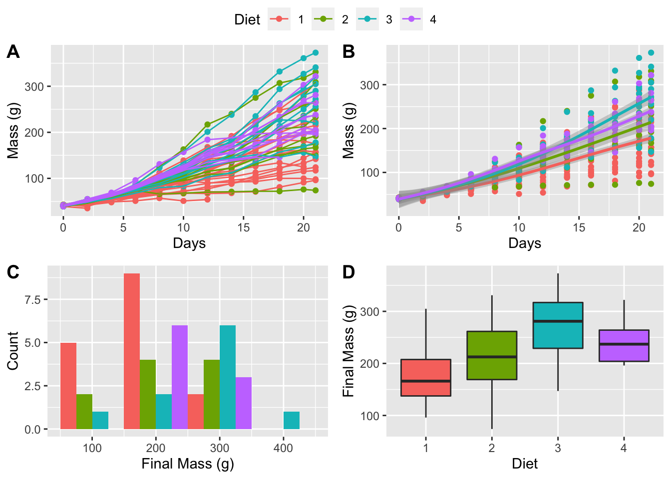
Figure 6.6: All four of our figures gridded together with an automagically created common legend.
The above figure looks great, so let’s save a copy of it as a PDF to our computer. In order to do so we will need to assign our figure to an object and then use the ggsave() function on that object.
# First we must assign the code to an object name
grid_1 <- ggarrange(lm_1, histogram_1, density_1, violin_1,
                    ncol = 2, nrow = 2,
                    labels = c("A", "B", "C", "D"),
                    common.legend = TRUE)

# Then we save the object we created
ggsave(plot = grid_1, filename = "figures/grid_1.pdf")
6.4 Session info
installed.packages()[names(sessionInfo()$otherPkgs), "Version"]R> ggpubr forcats stringr dplyr purrr readr tidyr tibble
R> "0.4.0" "0.5.1" "1.4.0" "1.0.7" "0.3.4" "1.4.0" "1.1.3" "3.1.2"
R> ggplot2 tidyverse
R> "3.3.4" "1.3.1"