Chapter 3 Descriptive statistics: central tendency and dispersion
“I think it is much more interesting to live with uncertainty than to live with answers that might be wrong.”
–– Richard Feynman
In this Chapter we will focus on basic descriptions of the data, and these initial forrays are built around measures of the central tendency of the data (the mean, median, mode) and the dispersion and variability of the data (standard deviations and their ilk). The materials covered in this and the next two chapters concern a broad discussion that will aid us in understanding our data better prior to analysing it, and before we can draw inference from it. In this work flow it emerges that descriptive statistics generally precede inferential statistics.
Let us now turn to some of the most commonly used descriptive statistics, and learn about how to calculate them.
3.1 Samples and populations
This is a simple toy example. In real life, however, our data will be available in a tibble (initially perhaps captured in MS Excel before importing it as a .csv file into R, where the tibble is created). To see how this can be done more realistically using actual data, let us turn to the ChickenWeight data, which, as before, we place in the object chicks. Recall the pipe operator (%>%, pronounced ‘then’) that we introduced in the Intro R Workshop—we will use that here, throughout. Let us calculate the sample size:
To determine the sample size we can use the length() or n() functions; the latter is for use within dplyr’s summarise() method, and it is applied without writing anything inside of the (), like this:
# first load the tidyverse packages that has the pipe operator, %>%
library(tidyverse)
chicks <- as_tibble(ChickWeight)

# how many weights are available across all Diets and Times?
chicks %>%
  summarise(length = n())
R> # A tibble: 1 x 1
R> length
R> <int>
R> 1 578# the same as
length(chicks$weight)R> [1] 578Note that this gives us the number of all of the chicks in the experiment, irrespective oif which diet they were given. It will make more sense to know how many chicks were assigned to each of the experimental diets they were raised on.
Task: Figure out the number of chicks in each of the feed categories.
3.2 Measures of central tendency
| Statistic | Function | Package |
|---|---|---|
| Mean | mean() |
base |
| Median | median() |
base |
| Skewness | skewness() |
e1071 |
| Kurtosis | kurtosis() |
e1071 |
The measures of central tendency are also sometimes called ‘location’ statistics. We have already seen summaries of the mean and the median when we called to summary() function on the chicks data in Chapter 2. Here we shall show you how they can be calculated using some built-in R functions.
3.2.1 The mean
The sample mean is the arithmetic average of the data, and it is calculated by summing all the data and dividing it by the sample size, n. The mean, \(\bar{x}\), is calculated thus:
\[\bar{x} = \frac{1}{n}\sum_{i=1}^{n}x_{i} = \frac{x_{1} + x_{2} + \cdots + x_{n}}{n}\] where \(x_{1} + x_{2} + \cdots + x_{n}\) are the observations and \(n\) is the number of observations in the sample.
In R one can quickly apply the mean() function to some data. Let us create a vector of arbitrary numbers using the ‘combine’ function, c(), and then apply the function for the mean:
# combine a series of numbers into a vector;
# hint: use this function in the exercises that we will require from you
# later on...
dat1 <- c(23, 45, 23, 66, 13)
mean(dat1)
R> [1] 34Below, we use another tidyverse package, dplyr and its summarise() function, whose purpose it is to summarise the entire column into one summary statistic, in this case the mean:
chicks %>%
  summarise(mean_wt = mean(weight))
R> # A tibble: 1 x 1
R> mean_wt
R> <dbl>
R> 1 122.We can achieve the same using the more traditional syntax, which in some instances may be slightly less verbose, but less user-friendly, especially when multiple summary statistics are required (we shall later on how we can summarise a vector of data into multiple statistics). The traditional syntax is:
# the '$' operator is used to denote a variable inside of the tibble
mean(chicks$weight)
R> [1] 121.8183Task: How would you manually calculate the mean mass for the chicks? Do it now!
Notice above how the two approaches display the result differently: in the first instance, using summarise(), the answer is rounded to zero decimal places; in the second, it is displayed (here) at full precision. The precision of the answer that you require depends on the context of your study, so make sure that you use the appropriate number of significant digits. Using the summarise() approach again, here is how you can adjust the number of decimal places of the answer:
# the value printed in the HTML/PDF versions is incorrect;
# check in the console for correct output
chicks %>%
  summarise(mean_wt = round(mean(weight), 1))
R> # A tibble: 1 x 1
R> mean_wt
R> <dbl>
R> 1 122.Task: What happens when there are missing values (
NA)? Consult the help file for themean()function, discuss amongst yourselves, and then provide a demonstration to the class of how you would handle missing values. Hint: use thec()function to capture a series of data that you can then use to demonstrate your understanding.
At this point it might be useful to point out that the mean (or any function for that matter, even one that does not yet exist) can be programatically calculated. Let us demonstrate the principle by reproducing the mean function from the constituent parts:
chicks %>%
  summarise(mean_wt = sum(weight) / n())
R> # A tibble: 1 x 1
R> mean_wt
R> <dbl>
R> 1 122.The mean is quite sensitive to the presence of outliers or extreme values in the data, and it is advised that its use be reserved for normally distributed data from which the extremes/outliers have been removed. When extreme values are indeed part of our data and not simply ‘noise,’ then we have to resort to a different measure of central tendency: the median.
*Task:** In statistics, what do we mean with ‘noise?’
3.2.2 The median
The median can be calculated by ‘hand’ (if you have a small enough amount of data) by arranging all the numbers in sequence from low to high, and then finding the middle value. If there are five numbers, say 5, 2, 6, 13, 1, then you would arrange them from low to high, i.e. 1, 2, 5, 6, 13. The middle number is 5. This is the median. But there is no middle if we have an even number of values. What now? Take this example sequence of six integers (they may also be floating point numbers), which has already been ordered for your pleasure: 1, 2, 5, 6, 9, 13. Find the middle two numbers (i.e. 5, 6) and take the mean. It is 5.5. That is the median.
Let us find the median for the weights of the chickens in the ChickWeight data:
chicks %>%
  summarise(med_wt = median(weight))
R> # A tibble: 1 x 1
R> med_wt
R> <dbl>
R> 1 103The median is therefore the value that separates the lower half of the sample data from the upper half. In normally distributed continuous data the median is equal to the mean. Comparable concepts to the median are the 1st and 3rd quartiles, which, respectively, separate the first quarter of the data from the last quarter—see later. The advantage of the median over the mean is that it is unaffected (i.e. not skewed) by extreme values or outliers, and it gives an idea of the typical value of the sample. The median is also used to provide a robust description of non-parametric data (see Chapter 4 for a discussion on normal data and other data distributions).
3.2.3 Skewness
Skewness is a measure of symmetry, and it is best understood by understanding the location of the median relative to the mean. A negative skewness indicates that the mean of the data is less than their median—the data distribution is left-skewed. A positive skewness results from data that have a mean that is larger than their median; these data have a right-skewed distribution.
library(e1071)
skewness(faithful$eruptions)
R> [1] -0.4135498Task: Is the distribution left or right skewed?
3.2.4 Kurtosis
Kurtosis describes the tail shape of the data’s distribution. A normal distribution has zero kurtosis and thus the standard tail shape (mesokurtic). Negative kurtosis indicates data with a thin-tailed (platykurtic) distribution. Positive kurtosis indicates a fat-tailed distribution (leptokurtic).
# library(e1071)
kurtosis(faithful$eruptions)
R> [1] -1.5116053.3 Measures of variation and spread
Since the mean or median does not tell us everything there is to know about data, we will also have to determine some statistics that inform us about the variation (or spread or dispersal or inertia) around the central/mean value.
| Statistic | Function |
|---|---|
| Variance | var() |
| Standard deviation | sd() |
| Minimum | min() |
| Maximum | max() |
| Range | range() |
| Quantile | quantile() |
| Covariance | cov() |
| Correlation | cor() |
3.3.1 The variance and standard deviation
The variance and standard deviation are examples of interval estimates. The sample variance, \(S^{2}\), may be calculated according to the following formula:
\[S^{2} = \frac{1}{n-1}\sum_{i=1}^{n}(x_{i}-\bar{x})^{2}\]
This reads: “the sum of the squared differences from the mean, divided by the sample size minus 1.”
To get the standard deviation, \(S\), we take the square root of the variance, i.e. \(S = \sqrt{S^{2}}\).
No need to plug these equations into MS Excel. Let us quickly calculate \(S\) in R. Again, we use the chicks data:
chicks %>%
  summarise(sd_wt = sd(weight))
R> # A tibble: 1 x 1
R> sd_wt
R> <dbl>
R> 1 71.1The interpretation of the concepts of mean and median are fairly straight forward and intuitive. Not so for the measures of variance. What does \(S\) represent? Firstly, the unit of measurement of \(S\) is the same as that of \(\bar{x}\) (but the variance doesn’t share this characteristic). If temperature is measured in °C, then \(S\) also takes a unit of °C. Since \(S\) measures the dispersion around the mean, we write it as \(\bar{x} \pm S\) (note that often the mean and standard deviation are written with the letters mu and sigma, respectively; i.e. \(\mu \pm \sigma\)). The smaller \(S\) the closer the sample data are to \(\bar{x}\), and the larger the value is the further away they will spread out from \(\bar{x}\). So, it tells us about the proportion of observations above and below \(\bar{x}\). But what proportion? We invoke the the 68-95-99.7 rule: ~68% of the population (as represented by a random sample of \(n\) observations taken from the population) falls within 1\(S\) of \(\bar{x}\) (i.e. ~34% below \(\bar{x}\) and ~34% above \(\bar{x}\)); ~95% of the population falls within 2\(S\); and ~99.7% falls within 3\(S\).
Like the mean, \(S\) is affected by extreme values and outliers, so before we attach \(S\) as a summary statistic to describe some data, we need to ensure that the data are in fact normally distributed. We will talk about how to do this in Chapter 6, where we will go over the numerous ways to check the assumption of normality. When the data are found to be non-normal, we need to find appropriate ways to express the spread of the data. Enter the quartiles.
3.3.2 Quantiles
A more forgiving approach (forgiving of the extremes, often called ‘robust’) is to divide the distribution of ordered data into quarters, and find the points below which 25% (0.25, the first quartile), 50% (0.50, the median) and 75% (0.75, the third quartile) of the data are distributed. These are called quartiles (for ‘quarter;’ not to be confused with quantile, which is a more general form of the function that can be used to divide the distribution into any arbitrary proportion from 0 to 1). In R we use the quantile() function to provide the quartiles; we demonstrate two approaches:
quantile(chicks$weight)R> 0% 25% 50% 75% 100%
R> 35.00 63.00 103.00 163.75 373.00chicks %>%
summarise(min_wt = min(weight),
qrt1_wt = quantile(weight, p = 0.25),
med_wt = median(weight),
qrt3_wt = median(weight, p = 0.75),
max_wt = max(weight))R> # A tibble: 1 x 5
R> min_wt qrt1_wt med_wt qrt3_wt max_wt
R> <dbl> <dbl> <dbl> <dbl> <dbl>
R> 1 35 63 103 103 373# note median(weight) is the same as quantile(weight, p = 0.5)
# in the summarise() implementation, aboveTask: What is different about the
quantile()function that caused us to specify the calculation in the way in which we have done so above? You will have to consult the help file, read it, understand it, think about it, and experiment with the ideas. Take 15 minutes to figure it out and report back to the class.
3.3.3 The minimum, maximum and range
A description of the extent of the data can also be provided by the functions min(), max() and range().
These statistics apply to data of any distribution, and not only to normal data. This if often the first place you want to start when looking at the data for the first time. We’ve seen above how to use min() and max(), so below we will quickly look at how to use range() in both the base R and tidy methods:
range(chicks$weight)R> [1] 35 373chicks %>%
summarise(lower_wt = range(weight)[1],
upper_wt = range(weight)[2])R> # A tibble: 1 x 2
R> lower_wt upper_wt
R> <dbl> <dbl>
R> 1 35 373Note that range() actually gives us the minimum and maximum values, and not the difference between them. To find the range value properly we must be a bit more clever:
range(chicks$weight)[2] - range(chicks$weight)[1]R> [1] 338chicks %>%
summarise(range_wt = range(weight)[2] - range(weight)[1])R> # A tibble: 1 x 1
R> range_wt
R> <dbl>
R> 1 3383.3.4 Covariance
3.3.5 Correlation
The correlation coefficient of two matched (paired) variables is equal to their covariance divided by the product of their individual standard deviations. It is a normalised measurement of how linearly related the two variables are.
Graphical displays of correlations are provided by scatter plots as can be seen in Section X.
3.4 Missing values
As mentioned in Chapter 2, missing data are pervaise in the biological sciences. Happily for us, R is designed to handle these data easily. It is important to note here explicitly that all of the basic functions in R will by default NOT ignore missing data. This has been done so as to prevent the user from accidentally forgetting about the missing data and potentially making errors in later stages in an analysis. Therefore, we must explicitly tell R when we want it to ommit missing values from a calculation. Let’s create a small vector of data to demonstrate this:
dat1 <- c(NA, 12, 76, 34, 23)

# Without telling R to ommit missing data
mean(dat1)
R> [1] NA# Ommitting the missing data
mean(dat1, na.rm = TRUE)R> [1] 36.25Note that this argument, na.rm = TRUE may be used in all of the functions we have seen thus far in this chapter.
3.5 Descriptive statistics by group
Above we have revised the basic kinds of summary statistics, and how to calculate them. This is nice. But it can be more useful. The real reason why we might want to see the descriptive statistics is to facilitate comparisons between groups. In the chicks data we calculated the mean (etc.) for all the chickens, over all the diet groups to which they had been assigned (there are four factors, i.e. Diets 1 to 4), and over the entire duration of the experiment (the experiment lasted 21 days). It would be more useful to see what the weights are of the chickens in each of the four groups at the end of the experiment — we can compare means (± SD) and medians (± interquartile ranges, etc.), for instance. You’ll notice now how the measures of central tendency is being combined with the measures of variability/range. Further, we can augment this statistical summary with many kinds of graphical summaries, which will be far more revealing of differences (if any) amongst groups. We will revise how to produce the group statistics and show a range of graphical displays.
3.5.1 Groupwise summary statistics
At this point you need to refer to Chapter 10 (Tidy data) and Chapter 11 (Tidier data) in the Intro R Workshop to remind yourself about in what format the data need to be before we can efficiently work with it. A hint: one observation in a row, and one variable per column. From this point, it is trivial to do the various data descriptions, visualisations, and analyses. Thankfully, the chicks data are already in this format.
So, what are the summary statistics for the chickens for each diet group at day 21?
grp_stat <- chicks %>%
  filter(Time == 21) %>%
  group_by(Diet, Time) %>%
  summarise(mean_wt = round(mean(weight, na.rm = TRUE), 2),
            med_wt = median(weight, na.rm = TRUE),
            sd_wt = round(sd(weight, na.rm = TRUE), 2),
            sum_wt = sum(weight),
            min_wt = min(weight),
            qrt1_wt = quantile(weight, p = 0.25),
            med_wt = median(weight),
            qrt3_wt = median(weight, p = 0.75),
            max_wt = max(weight),
            n_wt = n())
grp_stat
R> # A tibble: 4 x 11
R> # Groups: Diet [4]
R> Diet Time mean_wt med_wt sd_wt sum_wt min_wt qrt1_wt qrt3_wt max_wt n_wt
R> <fct> <dbl> <dbl> <dbl> <dbl> <dbl> <dbl> <dbl> <dbl> <dbl> <int>
R> 1 1 21 178. 166 58.7 2844 96 138. 166 305 16
R> 2 2 21 215. 212. 78.1 2147 74 169 212. 331 10
R> 3 3 21 270. 281 71.6 2703 147 229 281 373 10
R> 4 4 21 239. 237 43.4 2147 196 204 237 322 93.5.2 Displays of group summaries
There are several kinds of graphical displays for your data. We will show some which are able to display the spread of the raw data, the mean or median, as well as the appropriate accompanying indicators of variation around the mean or median.
library(ggpubr) # needed for arranging multi-panel plots
plt1 <- chicks %>%
  filter(Time == 21) %>%
  ggplot(aes(x = Diet, y = weight)) +
  geom_point(data = grp_stat, aes(x = Diet, y = mean_wt),
             col = "black", fill = "red", shape = 23, size = 3) +
  geom_jitter(width = 0.05) + # geom_point() if jitter not required
  labs(y = "Chicken mass (g)") +
  theme_pubr()

plt2 <- ggplot(data = grp_stat, aes(x = Diet, y = mean_wt)) +
  geom_bar(position = position_dodge(), stat = "identity",
           col = NA, fill = "salmon") +
  geom_errorbar(aes(ymin = mean_wt - sd_wt, ymax = mean_wt + sd_wt),
                width = .2) +
  labs(y = "Chicken mass (g)") +
  theme_pubr()
# position_dodge() places bars side-by-side
# stat = "identity" prevents the default count from being plotted

# a description of the components of a boxplot is provided in the help file
# geom_boxplot()
plt3 <- chicks %>%
  filter(Time == 21) %>%
  ggplot(aes(x = Diet, y = weight)) +
  geom_boxplot(fill = "salmon") +
  geom_jitter(width = 0.05, fill = "white", col = "blue", shape = 21) +
  labs(y = "Chicken mass (g)") +
  theme_pubr()

plt4 <- chicks %>%
  filter(Time %in% c(10, 21)) %>%
  ggplot(aes(x = Diet, y = weight, fill = as.factor(Time))) +
  geom_boxplot() +
  geom_jitter(shape = 21, width = 0.1) +
  labs(y = "Chicken mass (g)", fill = "Time") +
  theme_pubr()

ggarrange(plt1, plt2, plt3, plt4, ncol = 2, nrow = 2, labels = "AUTO")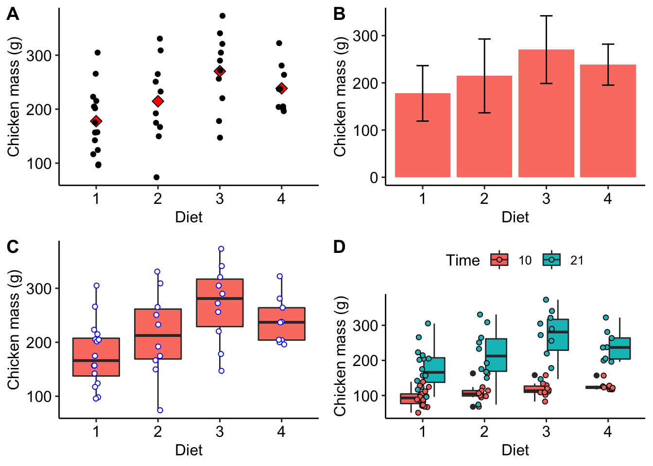
Figure 3.1: A) Scatterplot of the mean and raw chicken mass values. B) Bar graph of the chicken mass values, showing whiskers indicating 1 ±SD. C) Box and whisker plot of the chicken mass data.
3.6 Exercises
3.6.1 Exercise 1
Notice how the data summary for chicken weights contained within wt_summary is very similar to the summary returned for weight when we apply summary(chicks). Please use the summarise() approach and construct a data summary with exactly the same summary statistics for weight as that which summary() returns.